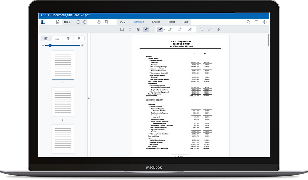
Datasite's Future Document Viewer
My Role
I expanded my role as a product delivery manager and worked as a UX designer over the course of this project. We went from product discovery through high definition prototypes.
SKILLS
-
Reusable Component Library
-
User Interviews
-
Customer Journey Map
-
Figma
TEAM
-
Senior UX/UI Designer
-
Client Services Team
-
FE Engineer
-
Product Design Team
TIMELINE & OUTCOME
-
2 Months
-
Interactive Prototypes
-
Project Passed Onto Another Product Team
ROLE
-
UX Designer
-
UI Designer
-
Researcher
Let's start with some context.
COMPANY BACKGROUND:
Datasite is a SaaS platform that provides products to quicken the mergers & acquisitions deal life cycle.
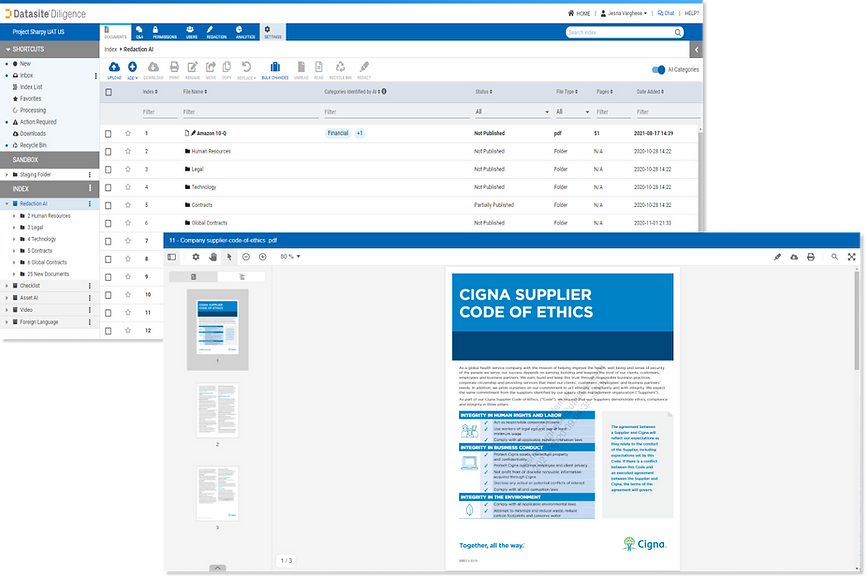
Our main offering is Diligence, a virtual data room where documents are uploaded, edited, organized, and more. Within Diligence there is a view called the documents viewer. Similar to Google Drive, when you click to open a document it will display the document itself and functionality you can utilize to edit, organize, etc.
PURPOSE:
The goal was to increase value to our customers, by adding new functionality to help our clients get their mergers & acquisitions deals done faster.
Datasite had the opportunity to upgrade to the latest version of PDFTron, a document viewing framework we utilize to allow our users to view sensitive documents. With the new version of PDFTron, there was a large offering of capabilities that we could choose to incorporate onto our platform.
Who are we helping?
Our users are investment bankers who are reviewing documents during the due diligence phase of a deal to determine if they want to sell or buy a company.
USER
INVESTMENT BANKER
There are thousands of documents that need to be looked through and reviewed in order for a company to go through with a deal.
ACTION
REVIEW DOCUMENTS

The faster the due diligence process the better. Our users want to determine if they want to move forward with a company as quickly as possible.
NEED
MOVE QUICKLY
Research
UNDERSTANDING OUR PERSONAS:
In order to understand user behavior, we utilized existing persona documentation and created customer journey maps.
Previous product teams did extensive customer discovery in order to develop core personas for our products. As a UX/UI designer on this project, I utilized existing persona documentation from the product design team and was able to understand user behavior and pain points through interviewing client service members here at Datasite.

CLIENT SERVICE INTERVIEWS:
Client Service interviews gave us additional insight into our users biggest pain points.
We interviewed 2 members from our client service team and went over the current experience of the document viewer and asked for any pain points, suggestions, or concerns brought up by clients. These interviews lead us to understanding what our users biggest pain points are and how we could potentially go about solving them.
Client Services are an excellent window into how our users are feeling about existing products and have lots of insight into problems we can work on solving in the future.
.png)
PROBLEM:
Investment bankers want to work faster.
Our users complaints and concerns are all about making the process faster and easier. They don’t want to spend 80 hours a week in the platform organizing, editing, and going through documents. If we can save them time by simplifying their process, that is where we can bring in immense value. The faster they do their work, the more likely a deal is to go through, and the more likely they are to make a lot of money.
"...investment bankers are often overworked,
short on time, and actively trying to make tough deadlines. They want our platform to be quick, intuitive, and easy...."
-Client Services, Datasite
What should we build?
PROBLEM SOLVING PROCESS:
What can we utilize from the upgraded version of PDFTron to help save users time?
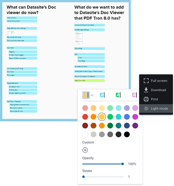
We started off by looking at what new capabilties the upgraded version of PDFTron had. We created a mural board to visually look at the differences between our current documents viewer and PDFTron’s latest 8.0 version. We thought about which features our users could benefit from, keeping their pain points in mind, and mocked up some prototypes in order to get initial feedback from the design team.
DESIGN AND ENGINEERING REVIEW:
We got feedback from product, UX, and engineering in order to design with business needs & technical feasibility in mind.
From the design team we got feedback which lead myself and the other designer on this project to begin mocking up some feature specific screens in figma that we could get reviewed. We also consulted one of our front end engineers who is a subject matter expert on PDFTron and the documents viewer. We went over the new functionality with him and talked through feasibility for each of the new features we were thinking of implementing.
Solutions
PROTOTYPES:
Landing on designs that would provide value by saving users time.
After going through the business requirements, customer discovery, technical feasibility, and design feedback we landed on the following 3 solutions to improve the document viewer experience for users. We focused our energy on saving them time during the due diligence phase of their mergers and aquisitions deal lifecycle.
1. Navigating to Comments
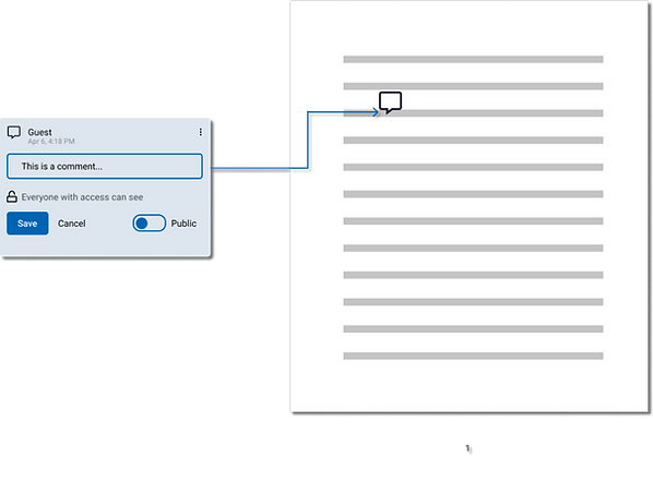
With the current state of comments, there is no visual indication on the page as to what the comment is refering to. This can be frustrating for users when there are multiple comments on a document and they have to spend time reading through the page for context.
We added arrows joining the comment on the left pane to the area of the document it was referring to, making it easily identifiable by readers. With multiple comments on a document, this will save users time and avoid confusion.
2. Dark Mode
This has been an ask and is becoming common for most applications. Many of our users work late into the night and dark mode can be of value.
We needed to choose an icon that was intuitive for users to access light and dark mode, and we needed to update the page so it was still readable.

3. Intuitive Page Settings
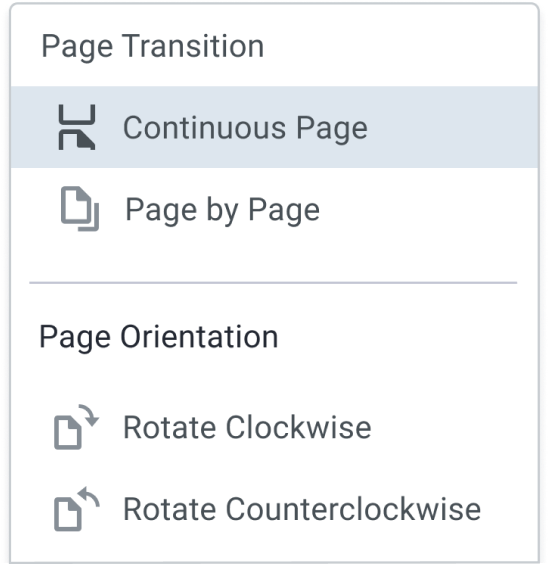
Our original page setting icons did not have text descriptions and were not easily recognizable for users. This lead to confusion and a frustrating editing experience.
We updated our page setting icons and added descriptions next to them to make the options clearer to our users. This way users could easily and quickly edit their page layout.
Impact
NEXT STEPS:
This project ended with high fidelity prototypes and was passed off to another product team for continued discovery and development.
With the addition of these capabilities, we provided users value by saving them time and solving for pain points that slowed down their work!

Learnings and Takeaways
